
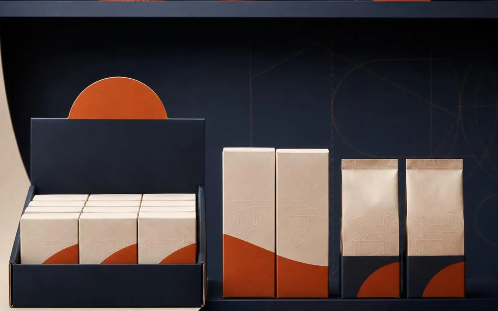
Online, your box arrives after the sale is already made. On a shelf, it has to make the sale itself, standing shoulder to shoulder with rivals while you are nowhere in sight. That is a very different job.
A shelf is a competition your box enters alone. It cannot answer questions, tell its story or explain why it costs what it costs. So the design has to do all of that quietly, in the second or two a shopper spends scanning the row.
Think face-forward first
On a shelf, your front panel does the heavy lifting. It earns the pick-up. If it is cluttered or timid, the hand moves on to the box beside it.
Keep the front clear: what the product is, who makes it, and one reason to reach for it. Once the box is in someone’s hands, the sides and back close the sale — ingredients, story, how to use it, the small print people read when they are already half-persuaded.
A good habit is to design the front for a stranger and the back for a buyer. The stranger needs to understand you fast. The buyer wants reassurance before they commit.
Plan for the barcode and the price tag
Every retail box needs somewhere for a barcode, and often somewhere for the shop’s own price label. If you don’t plan that space, someone else will — usually by slapping a sticker straight across your logo.
Leave a clean, quiet zone for the barcode where it can be scanned without turning the box upside down. Think about where a shop is likely to add a price label and keep that area calm rather than crowded. It is a small courtesy that keeps your design intact on the shelf.
Stacking, fronting-up and staying upright
Shop staff handle stock all day. They front-up shelves, restock from behind and expect boxes to behave. A box that topples, slumps or won’t stack neatly quietly annoys the people deciding whether to reorder.
- Flat, stable base: so the box stands square and doesn’t lean into its neighbour.
- Sensible proportions: tall and narrow looks elegant but tips easily; a slightly wider footprint survives a busy aisle.
- Predictable stacking: if boxes sit on top of one another in the stockroom, they need flat tops and enough strength not to crush.
None of this shows up in a photograph. It shows up on a Tuesday afternoon when someone is restocking in a hurry — and that is exactly when you want your packaging to make life easy. Our retail boxes are built with that handling in mind.
Counter displays for the small stuff
Not everything lives on a shelf. Lip balms, soaps, small jars and impulse buys often do their best work in a counter display, right where people pay.
A tidy counter unit turns a single product into a little block of colour that catches the eye at the till. It keeps small items from wandering, makes fronting-up simple, and gives a shopkeeper a reason to keep your range near the money. If your product is small enough to be forgotten on a shelf, the counter is where it earns its keep.
The same logic applies to how many units you fit in a display. Pack it too full and it looks cluttered; leave it too sparse and it reads as unloved. A counter unit that holds a sensible handful, with a clear spot to restock from, gives the shopkeeper one less thing to think about.
Board and finish that survive the shop floor
A shop is a rougher environment than a photo studio. Boxes get slid across counters, wedged into bags and knocked by passing sleeves, and the board underneath has to cope.
Board weight is measured in gsm, and a slightly heavier board holds its edges better under that kind of handling. The finish matters too: a laminate can shrug off scuffs and fingerprints that a bare board would show, which keeps a well-thumbed box looking fresh. It is worth thinking about how a box ages, not just how it looks on day one.
What buyers and shopkeepers quietly judge
Retail buyers rarely tell you why they didn’t reorder. But there is a short list of things they notice without comment.
- Boxes that arrive scuffed: corners knocked in transit read as tired before they ever reach the shelf.
- Boxes that won’t stack: anything that makes merchandising harder is a mark against you.
- Colour that fades in the window: sunlight is unforgiving, and a faded front panel makes a fresh product look old.
These are unglamorous details, but they are the ones that decide whether your box gets a second life on the shelf or quietly disappears. If your product spends time in a window or catches strong daylight, it is worth thinking about how the design and finish hold up — and whether a window box that shows the product might work harder than a printed panel alone.
Bringing it together
Retail-ready packaging is really just design that keeps working when you have left the room. A confident front, a clean spot for the barcode, a base that stands square, and a finish that survives handling and daylight. Get those right and your box does its job on the shelf whether you are watching or not.
If you are moving from online into shops and want a box that behaves on a shelf as well as it looks in a photo, tell us where it will be sold and we’ll help you plan for it.