
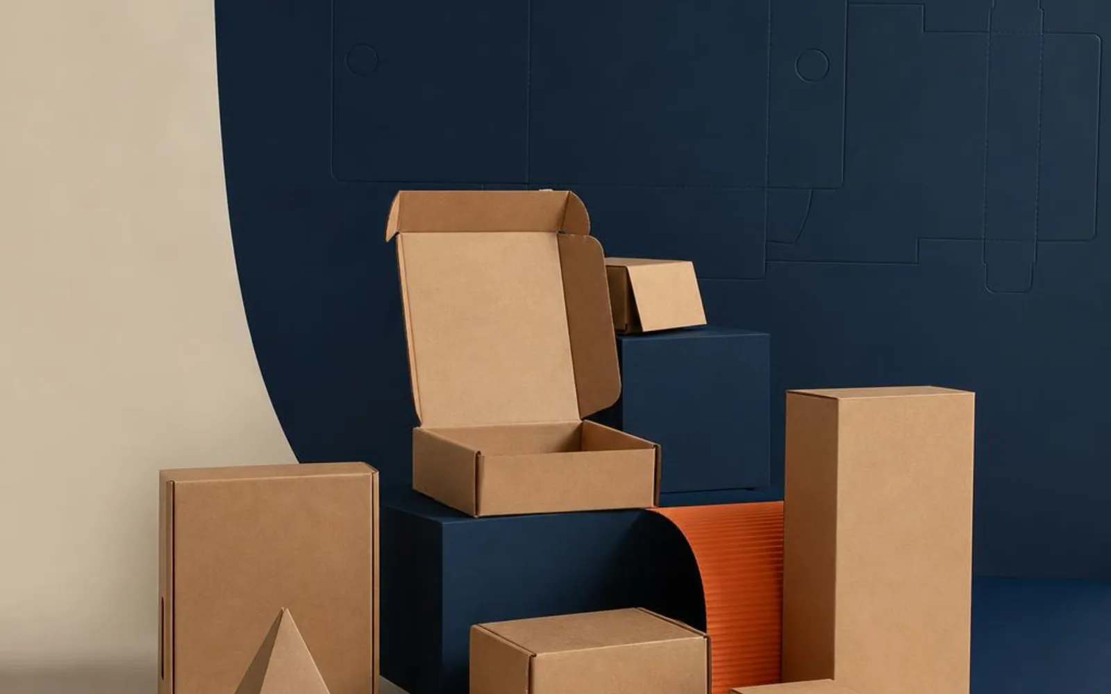
Brown doesn't sound like a design choice. It sounds like the absence of one — the colour board comes in before anyone's decided anything. And yet, used with a bit of thought, kraft is one of the smartest looks in packaging.
Its strength is honesty. Kraft is unbleached board that looks exactly like what it is, and in a world of high-gloss everything, that plainness has become a statement in its own right.
The honesty of kraft
Kraft board skips the bleaching step that turns pulp white, which is why it keeps that warm brown tone. It looks natural because it more or less is, and customers read that instantly. There's no pretence to it — the material isn't dressed up as something else.
That candour is the whole appeal. A kraft box says the brand has nothing to hide and isn't spending money on gloss for the sake of it. For a lot of small makers, that's exactly the message they want on the shelf.
Why minimal print sings on brown
Kraft rewards restraint. On white board you can throw colour at every corner; on brown, less almost always looks better. One or two ink colours, a simple mark, maybe a rubber-stamp aesthetic with a bit of string — that's kraft at its best.
- A single-colour logo stamped clean and central
- Black line work that reads crisp against the brown
- A stamp-and-string look that leans into the handmade feel
The brown does half the design work for you. Fill it with heavy print and you lose the very quality that made kraft worth choosing. The kraft boxes range is built around this understated approach.
How ink behaves on brown board
This is the practical bit people wish they'd known sooner. Ink sits differently on kraft than on white, because the brown shows through.
Colours mute. A bright red goes earthier, a blue goes softer, a yellow can more or less disappear. Kraft isn't the surface for vivid, true-to-screen colour — the board tints everything warm.
What it flatters is black and white. Black reads bold and confident against brown; white ink, printed as a solid, gives you a clean contrast that looks deliberate and modern. If you want colour to pop on kraft, you generally print a white base first — worth knowing before you commit to a bright palette.
Where kraft suits — and where it fights
Kraft has a natural home, and it's worth being honest about the edges of it.
It suits:
- Food and bakery — the natural look matches artisan, handmade and wholesome positioning. Food-safe options are available; just tell us what you're packing when you enquire. Formats across the food boxes range pair naturally with kraft.
- Handmade and craft goods — kraft and "made by hand" speak the same language.
- Rustic and considered gifting — where understatement is the point.
Where it fights: high-gloss beauty and luxury lines. If your brand trades on sleek, colour-perfect, high-shine presentation, brown board pulls the other way. Kraft reads as earthy and unpolished, which is a gift for some brands and a liability for others. Know which you are.
Kraft with a window or a sticker
For small runs, kraft has a quiet flexibility that's easy to overlook. Because the board already looks finished, you don't have to print it at all — a plain kraft box plus a printed sticker gives you a smart look with almost no setup.
That means you can change the sticker per product, per season or per batch without ordering new boxes each time. Add a window to show the goods, or a stamp for the personal touch, and one base box covers a surprising range of needs. For a maker testing lines or running small batches, that adaptability is worth real money.
Kraft comes in more than one form
"Kraft" describes the board's colour and character, not a single product. You'll find it as a flat, single-layer board for lighter boxes and bags, and as a corrugated kraft with a fluted middle for anything that needs to carry weight or take a knock. Same honest brown look, very different strength.
That range is useful. A folding kraft carton suits a bar of soap or a small food item; a corrugated kraft box suits posting or heavier goods. Knowing which you need saves you paying for strength you won't use, or ordering board too light for the job.
There's a texture question, too. Some kraft has a smooth face that takes print more cleanly; some keeps a rougher, more rustic grain. The rougher stock leans harder into the handmade look, which may be exactly what you want — or one step too far, depending on the brand.
The smart case for brown
Kraft isn't the right answer for every brand, but where it fits it's hard to beat: honest, understated, kind to a simple design and forgiving on small runs. Corrugated and kraft boards are widely recycled, which suits customers who read plain brown as considered rather than cheap.
If you're weighing up whether kraft suits your product and how print will sit on it, tell us what you're packing and we'll talk through board, ink and finish. Brown might just be the smartest colour on your shelf.