
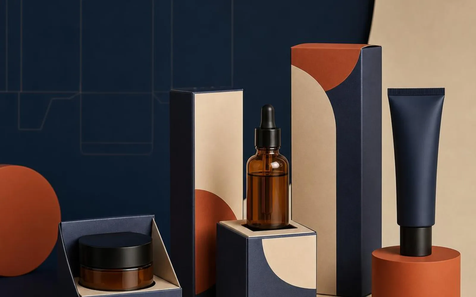
Beauty is bought with the eyes long before anyone tries the product. On a crowded shelf or a small phone screen, the box is doing most of the persuading — it is the first impression and often the deciding one.
That puts a lot of weight on packaging that might only be admired for a few seconds. Getting it right is less about decoration and more about knowing what beauty customers are actually reading into a box.
The box does the persuading
A cosmetic customer rarely gets to test before they buy, so they judge the product by its packaging. The box stands in for quality, care and price bracket before a single ingredient is read.
This is true on the shelf and truer still in unboxing videos, where the packaging is filmed, opened and shared. The box is part of the performance, not just the wrapper the product came in.
It also sets expectations. A customer who is impressed by the box before they reach the product is already inclined to like what they find, which is a gentle advantage worth having.
What premium actually reads as
There is a common instinct to signal premium by adding more — more foil, more colour, more detail. Beauty tends to work the other way.
Premium usually reads as restraint. Considered typography, a calm palette, a texture worth touching and plenty of breathing space say more than a busy design ever will.
- Typography — a small number of well-chosen typefaces, used consistently.
- Texture — a soft-touch finish or a subtle emboss that rewards the hand.
- Space — room around your logo rather than filling every panel.
For premium lines, rigid boxes give the weight and the deliberate open that customers associate with a higher-end product. A box that feels solid in the hand does a lot of the work before the lid even lifts.
None of this means spending your whole budget on decoration. Often the more restrained option looks the more expensive one, because it trusts the design to speak rather than piling on effects. If in doubt, take something away rather than adding it.
The shelfie effect
Beauty packaging leads a second life online. Customers photograph what they buy, and a box that looks good on camera earns you reach you did not pay for.
That means thinking about how the box looks in a flat-lay or a bathroom shelf, not only under shop lighting. A matt finish photographs cleanly without glare, and a design that stays legible when it is small on a screen travels a lot further.
It is worth checking your artwork at the size it will actually be seen. A layout that looks balanced at full size on a monitor can turn muddy and cramped once it is a thumbnail on a phone, so simplify until the important things still read.
Protecting fragile contents
Beauty products are often glass jars, pumps and droppers — lovely to hold and easy to damage. The box has to keep them safe from the warehouse to the bathroom cabinet.
An insert that holds a bottle firmly stops it rattling and cracking, and it also makes the opening feel more considered. Protection and presentation are not separate jobs here; a snug fit does both at once.
The way to get this right is to plan the box around the actual product rather than a rough estimate. Pumps and droppers add height, and a lid that catches on the packaging spoils the moment, so it helps to design with the finished item in front of you.
A coherent family across your range
Most beauty brands sell more than one product, and a range needs to hang together. When the whole line shares a look, it reads as a brand rather than a shelf of unrelated items.
A common trick is colour-coding: keep the layout, typography and structure identical across SKUs, and change one accent colour per line. Customers can tell the serum from the moisturiser at a glance while still seeing one coherent family. Our cosmetic boxes are well suited to that kind of consistent, multi-product approach.
Planning space for the necessary information
Beauty packaging has to carry practical information — ingredient lists, usage details and the small print your product needs. This is a design decision, not an afterthought to squeeze in at the end.
Plan where those panels live from the start so they are legible without crowding your branding. This is about layout and space rather than any legal claim — the point is simply that the information has a home, and the front of the box stays clean.
A common approach is to keep the front and lid for branding and reserve a side or the underside for the detail. That way nothing has to be squashed in at the last minute, and the box still tells the customer what they need to know once it is in their hands.
Beauty customers expect a box that looks considered, photographs well, protects what is inside and reads as part of a family. Lead with restraint, plan your information panels early, and keep the range coherent. When you are ready to shape your packaging, tell us about your products and we will help you plan it.